.gif)
Spool


PROCESS
This bold and vibrant brand refresh became a reflection of my own growth and evolving confidence as an Art Director and creative during my time at Spool. Even before this project officially began, I had already meaningfully contributed to the evolution of Spool's brand and design.
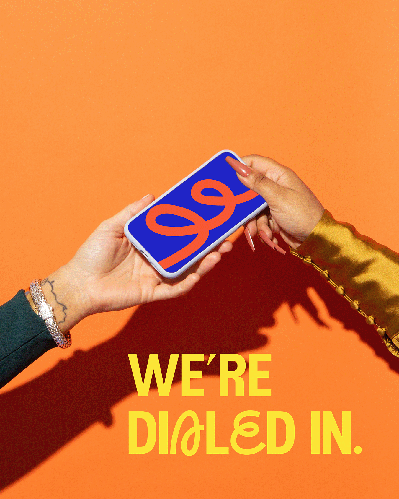
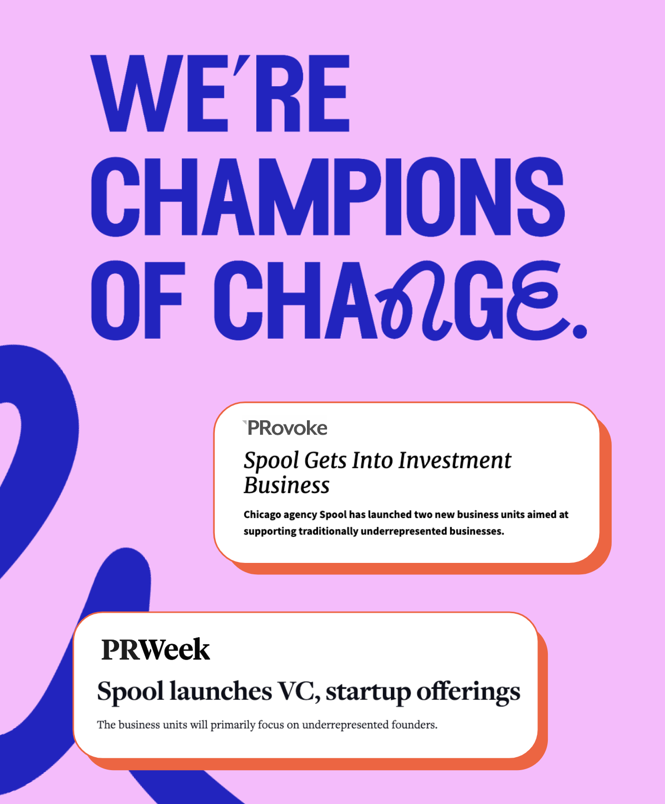
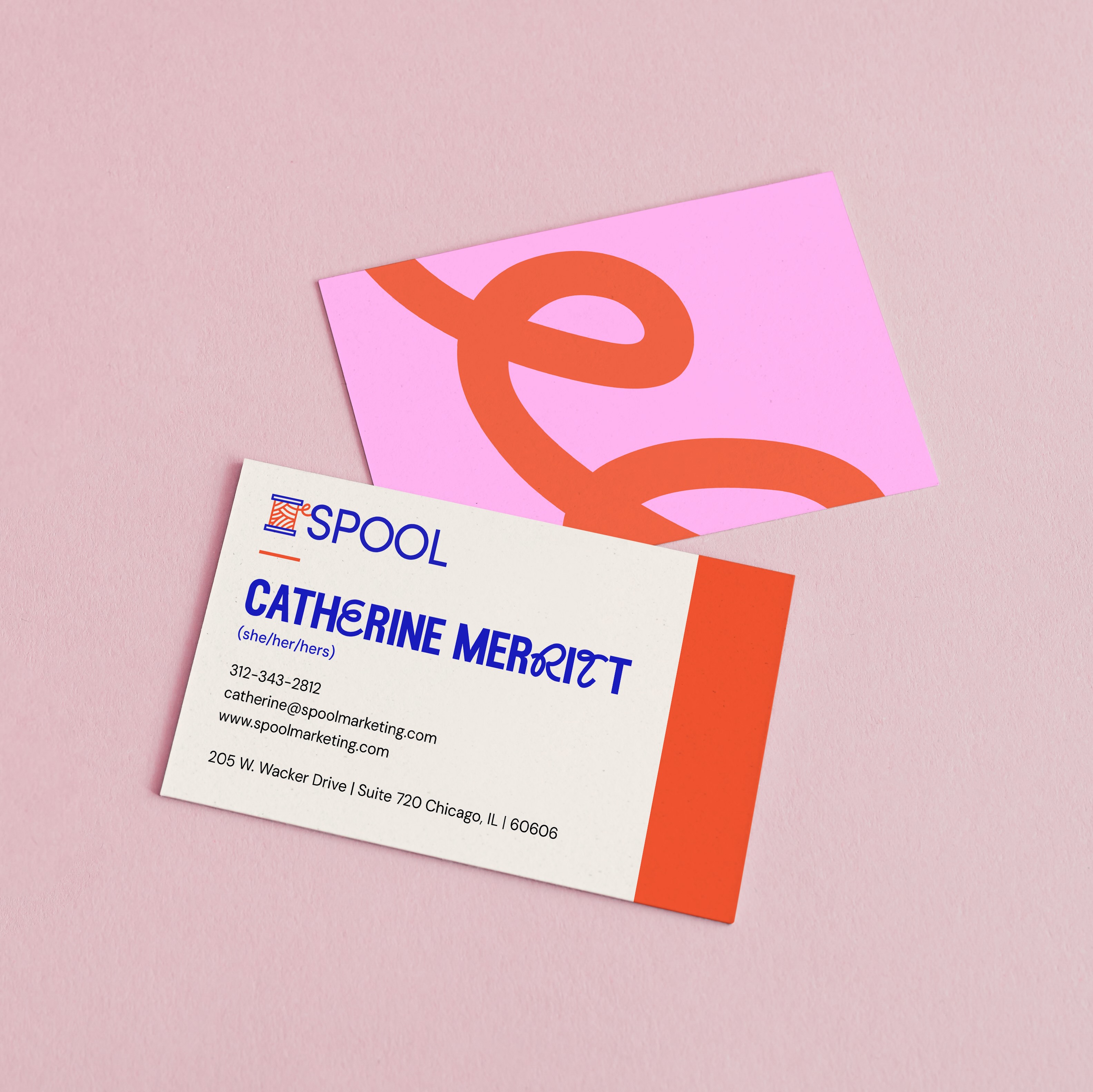
Sometime deep into the trying to make sense of it all/ I have 5 Illustrator documents open phase of my design exploration, I was hit with a stupid realization: What if we simply leaned into the existing brand equity Spool has in its name? The thread is what ties it all together; the brand, the right people, the right culture, and the right ideas to make Spool what it is.
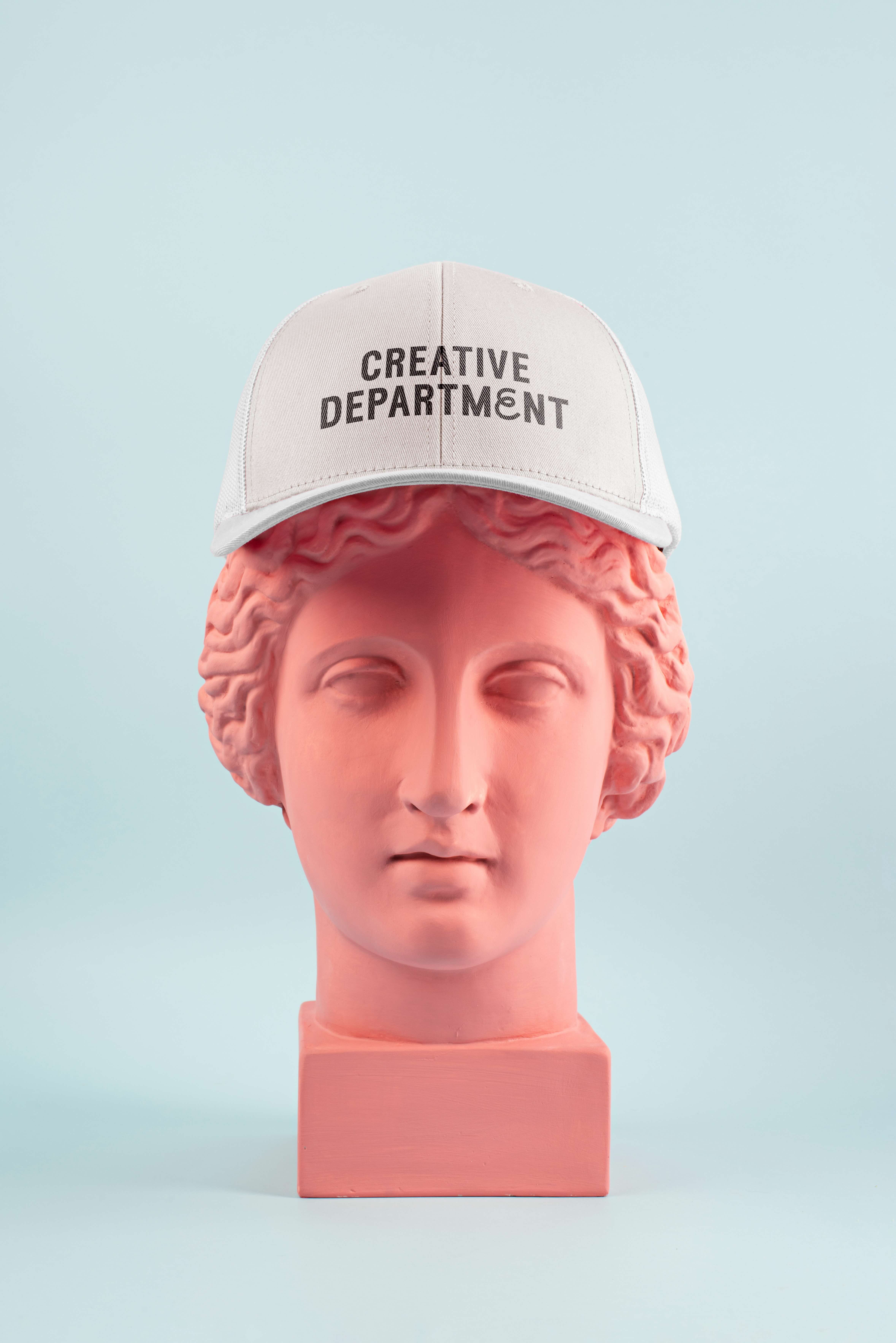
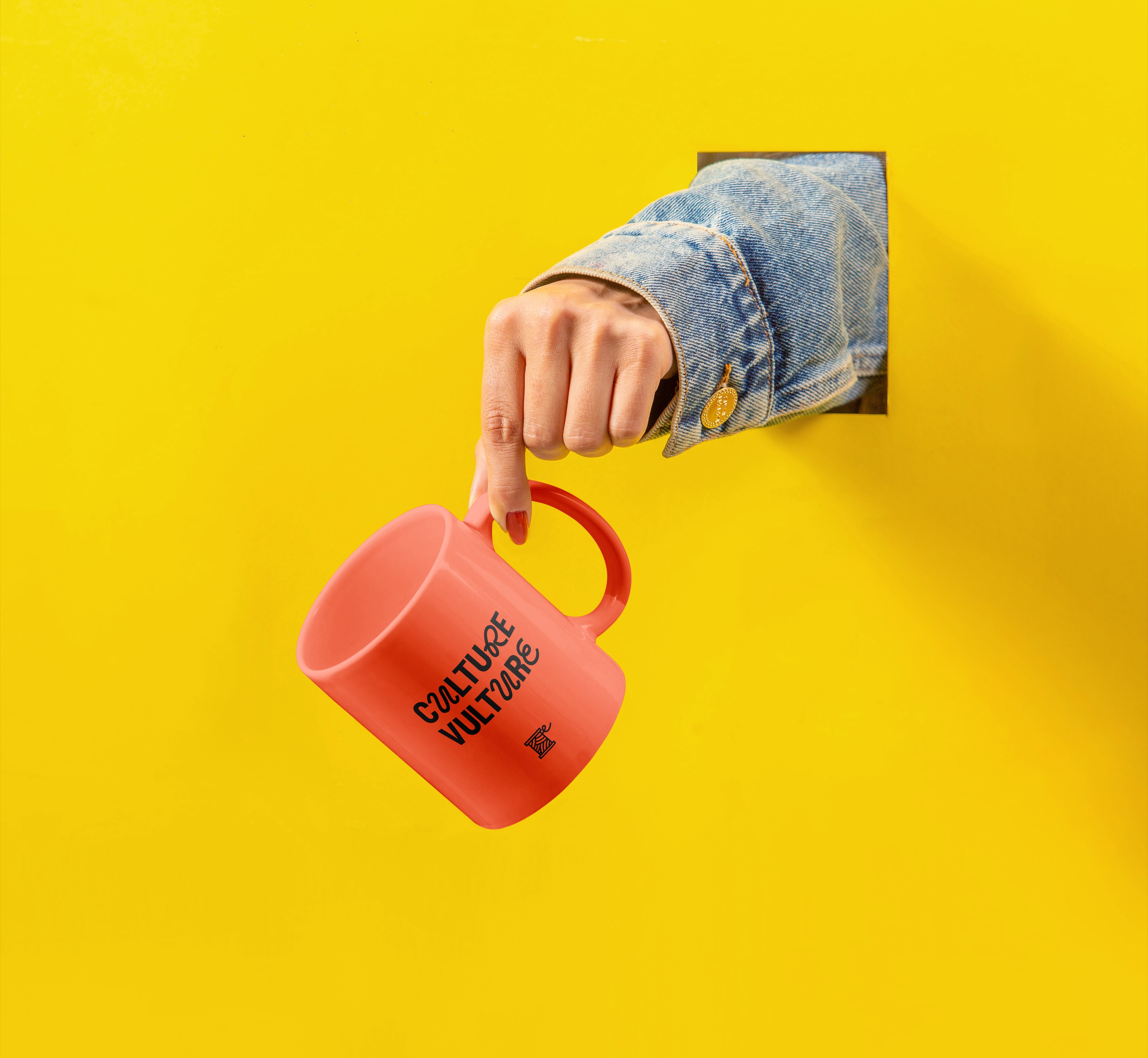
So instead of overhauling the design, I took what was working for us and amplified it, choosing vibrant colors that modernized our prior color palette, a playful and kinetic thread-like font, and unique photography. The end result was a really fun brand refresh that brought Spool’s essence to life in a way that felt authentic—earning rave reviews from internal and external stakeholders.


.gif)